Wednesday, September 28, 2011
1st project essay
I implemented emphasis, contrast, balance, flow,
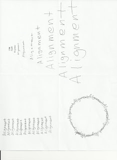
alignment, and repetition to create a single unified design under the rule of
thirds. The rule of thirds is that my work should be focused on emphasis the
most. Then balance should be placed on the second important point and contrast
should be the third. I put emphasis on the upper right corner and it leans
somewhat to the right. I placed balance on the rectangular shape in the middle
and contrast is in the bottom of the left corner. Alignment is placed on a bit
upper on emphasis. I then placed repetition in a rectangular and it is on the
very bottom of the right side. Lastly, flow is overlapping the letter B of the
balance word.
The focal point on my piece is emphasis. I
sketched more line along the edge of emphasis to get more focus on the word. The
secondary is balance that is starting from the letter H of emphasis. Contrast,
the tertiary element, is placed toward balance that is connected with emphasis.
Contrast and balance are not overlapped each other, but the three world,
emphasis, balance, and contrast are in same direction. But I flipped the
contrast word to express the real meaning of contrast. I used a circle to look
like a shell of a snail. It indicates the meaning of flow that is smooth and
soft. If you take a look at the shape deeply, it is including the letter of F,
L, O, and W. I was focused on balancing each word in my design by using all the
space of the frame. Especially, I expressed balance by putting the letter a in
the middle of the balance, because the letter “a” is in the middle of balance
of spelling. I repeated repetition a lot and filled up the rectangular with the
word. The alignment word is placed near by emphasis. The word is along the path
of circle that starts from the letter H and finish at S from emphasis. So it
means that a word follows the other word step by step. The negative space
within my design is enough and the space is balanced well. Contrast is in
medium scale. I used a variety type of the thickness and the thickest word in
my design is emphasis that is a focal point. The second thickest word is the
letter B and L from balance and third one is contrast. Others are gray except
for flow. Each word has a different font style. The letter E and B from balance
are overlapping flow and repetition respectively. The letter E of emphasis is
little cropped-off at edge of page. Balance and repetition are in the
horizontal line. Emphasis is going to downward to the right and alignment is
placed with the same direction with emphasis. Lastly, contrast is rotated at
about 110 degree.
Wednesday, September 21, 2011
Sunday, September 18, 2011
Sunday, September 11, 2011
Subscribe to:
Comments (Atom)


